I'm always tinkering around and writing little controls and things in my spare time. Every once in a while, one of those things speaks out to me and I clean them up and make them open source.
Check out some of my open source work:
(Splash page of current versions can be found at bfeher.github.io.)


Click to see animated .gifv!
BFPaperButton is a subclass of UIButton that behaves much like the new paper buttons from Google's Material Design Labs. All animation are asynchronous and are performed on sublayers. BFPaperButtons work right away with pleasing default behaviors, however they can be easily customized! The corner radius, tap-circle color, background fade color, and tap-circle diameter are all readily customizable via public properties.
BFPaperButtons come in 2 flavors, Flat or Raised. Flat BFPaperButtons have no shadow and will remain flat through all animations. Flat buttons can be transparent, in which case the background will also fade a little when tapped. Raised BFPaperButtons have a drop shadow that animates along with a tap, giving it the feeling of raising up with your touch. Raised BFPaperButtons do not look good with a clear background color since it will expose their shadow layer underneath.
By default, BFPaperButtons use "Smart Color" which will match the tap-circle and background fade colors to the color of the titleLabel. You can turn off Smart Color by setting the property, .usesSmartColor to NO. If you disable Smart Color, a gray color will be used for both the tap-circle and the background color fade. You can set your own colors via: .tapCircleColor and .backgroundFadeColor. Note that setting these disables Smart Color.


Click to see animated .gifv!
BFPaperView is a subclass of UIView that behaves much like the new paper views from Google's Material Design Labs. All animation are asynchronous and are performed on sublayers. BFPaperViews work right away with pleasing default behaviors, however they can be easily customized! The corner radius, tap-circle color, background fade color, and tap-circle diameter are all readily customizable via public properties.
BFPaperViews come in 2 flavors, Flat or Raised. Flat BFPaperViews have no shadow and will remain flat through all animations. Flat views can be transparent, in which case the background will also fade a little when tapped. Raised BFPaperViews have a drop shadow that animates along with a tap, giving it the feeling of raising up with your touch. Raised BFPaperViews do not look good with a clear background color since it will expose their shadow layer underneath.
By default, BFPaperViews use "Smart Color" which will match the tap-circle and background fade colors to the color of the titleLabel. You can turn off Smart Color by setting the property,.usesSmartColor to NO. If you disable Smart Color, a gray color will be used by default for both the tap-circle and the background color fade. You can set your own colors via: .tapCircleColor and.backgroundFadeColor. Note that setting these disables Smart Color.


Click to see animated .gifv!
BFPaperCheckbox is a subclass of UIButton that behaves much like the new paper checkboxes from Google's Material Design Labs. All animation are asynchronous and are performed on sublayers. BFPaperCheckboxes work right away with pleasing default behaviors, however they can be easily customized! The checkmark color and tap-circle color, both positive and negative (for checked and unchecked) are all readily customizable via public properties. You can also set whether or not the tap-circle should appear from the location of the tap, or directly from the center of the control.
By default, BFPaperCheckboxes use "Smart Color" which will match the tap-circle's positive color to the color of the checkmark (checkmarkColor). You can set your own colors via: .tapCirclePositiveColor and.tapCircleNegativeColor. Note that setting these disables Smart Color.


Click to see animated .gifv!
BFPaperTableViewCell is a subclass of UITableViewCell that behaves much like the new paper table cells from Google's Material Design Labs. All animation are asynchronous and are performed on sublayers.BFPaperTableViewCells work right away with pleasing default behaviors, however they can be easily customized! The tap-circle color, background fade color, and tap-circle diameter are all readily customizable via public properties.
By default, BFPaperTableViewCells use "Smart Color" which will match the tap-circle and background fade colors to the color of the textLabel. You can turn off Smart Color by setting the property, .usesSmartColor toNO. If you disable Smart Color, a gray color will be used by default for both the tap-circle and the background color fade. You can set your own colors via: .tapCircleColor and .backgroundFadeColor. Note that setting these disables Smart Color.
(Note: This is replaced by BFPaperTabBarController below. I no longer support this library but you are free to fork it!)

Click to see animated .gifv!
BFPaperTabBar is a subclass of UITabBar that behaves much like the new paper tab bar from Google's Material Design Labs. All animation are asynchronous and are performed on sublayers. BFPaperTabBars work right away with pleasing default behaviors, however they can be easily customized! The tap-circle color, background fade color, tap-circle diameter, underline color, and underline thickness are all readily customizable via public properties.
By default, BFPaperTabBars use "Smart Color" which will match the tap-circle, background fade, and underline bar colors to the color of the tabBar.tintColor. You can turn off Smart Color by setting the property,.usesSmartColor to NO. If you disable Smart Color, a gray color will be used by default for both the tap-circle and the background color fade. You can set your own colors via: .tapCircleColor and .backgroundFadeColor. Note that setting these disables Smart Color.


Click to see animated .gifv!
BFPaperTabBarController is a subclass of UITabBarController that behaves much like the new paper tab bar from Google's Material Design Labs. All animation are asynchronous and are performed on sublayers. BFPaperTabBarControllers work right away with pleasing default behaviors, however they can be easily customized! The tap-circle color, background fade color, tap-circle diameter, underline color, and underline thickness are all readily customizable via public properties.
By default, BFPaperTabBarControllers use "Smart Color" which will match the tap-circle, background fade, and underline bar colors to the color of the tabBar.tintColor. You can turn off Smart Color by setting the property, .usesSmartColor to NO. If you disable Smart Color, a gray color will be used by default for both the tap-circle and the background color fade. You can set your own colors via:.tapCircleColor and .backgroundFadeColor. Note that setting these disables Smart Color.


UIColor+BFPaperColors is a category for UIColor that adds class methods to conveniently produce over 240 new colors designed for flat or semi-flat interfaces by Google's Material Design Labs.


Click to see animated .gifv!
A progress HUD using BFRadialWaveView.
BFRadialWaveHUD supports blurring backgrounds, fullscreen, progress, dismiss callbacks and more!
Perfect for mesmerizing your users into forgetting about a long loading time @__@
Huge thanks to github user @kevin-hirsch for making his amazing KVNProgress HUD available under the MIT license! Most of the actual HUD code, as well as ALL of the image processing code is from that project. Thanks again!


Click to see animated .gifv!
A mesmerizing view with lots of options. It is meant to be used with BFRadialWaveHUD.
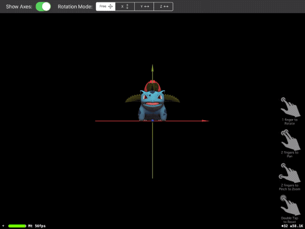
Just a small app I put together in Swift 4 to demonstrate loading and manipulating DAE files in SceneKit. Demonstrates both Local and Global rotations, as well as translation and zooming.
Note that I opted to use simple SceneKit properties to perform all actions, not manual matrix manipulations.
One neat app I got to make for a client was a product catalog complete with COLLADA 3D models of around 500 of their products. They wanted to be able to render and interact with each 3D model using gestures. This is the code I wrote for the actual 3D rendering and interacting.